Layouting in HTML is about laying your content out in columns and rows, just like a newspaper or magazine would, for example. As I’ve previously stated, web pages are just like real pages. Here you will learn what CSS flexbox and CSS grid are, how to use them, and how to create layouts in HTML using semantic elements. And the most important thing of all: how to center a div!

Semantic layout elements in HTML
The elements you should use to construct your layout are: <header>, <nav>, <section>, <footer>, <aside>, <article>. You should also use lists for your links.
Header with <header>
Main Content with <main>
Section with <section>
Article with <article>
Building layouts in HTML
There are 2 modern ways to build layouts in HTML:
- CSS Flexbox
- CSS Grid
In the past we used tables to build layouts, but that is no longer recommended. Tables should only be used for tabular data, not for layout purposes. Then, float and clear were used, but that is also no longer recommended.
CSS Flexbox
Flexbox defines a container that orders its children in one direction - a row or a column and it is great for building any layout. Let’s take a look at an example of a simple layout using Flexbox:
<div style="display: flex; flex-direction: row;">
  <div style="background-color: lightblue;">Column 1</div>
  <div style="background-color: lightgreen;">Column 2</div>
  <div style="background-color: lightcoral;">Column 3</div>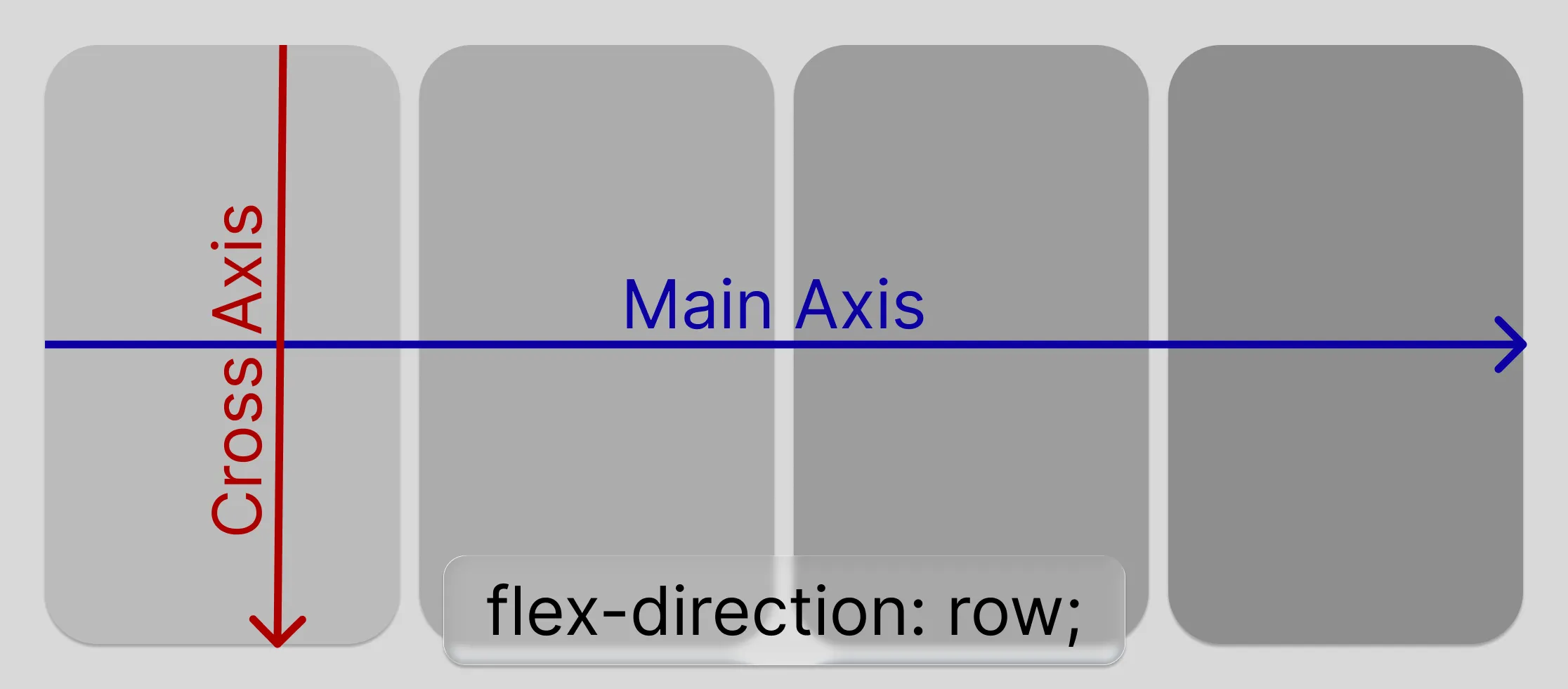
</div>As you can see, we defined a container div and added the display property to it with a value of flex. This tells the container, that it is now a flexbox and it should render its children in a row or a column.
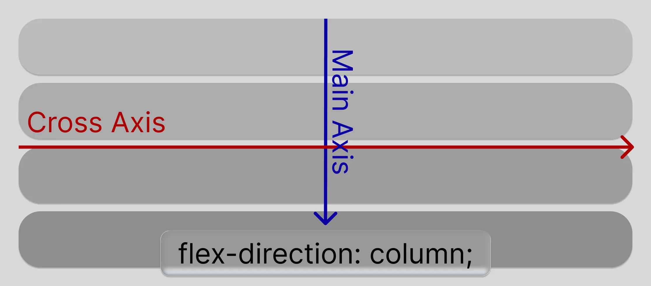
By default, flexbox renders its children in a row, but you can change that by setting the flex-direction property to column. You do not need to set the flex-direction property if you want a row layout, as that is the default value. This changes the main axis from horizontal to vertical.
The display property tells the box what type of container it should be.
Let’s try to render a column now:
<div style="display: flex; flex-direction: column;">
  <div style="background-color: lightblue;">Column 1</div>
  <div style="background-color: lightgreen;">Column 2</div>
  <div style="background-color: lightcoral;">Column 3</div>
</div>As you can now see, the items are rendered in a column.
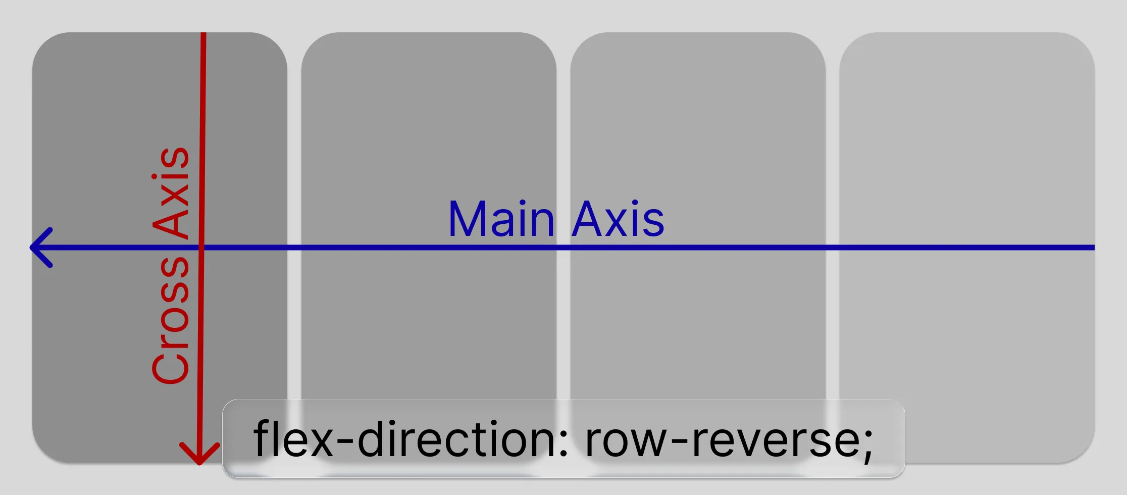
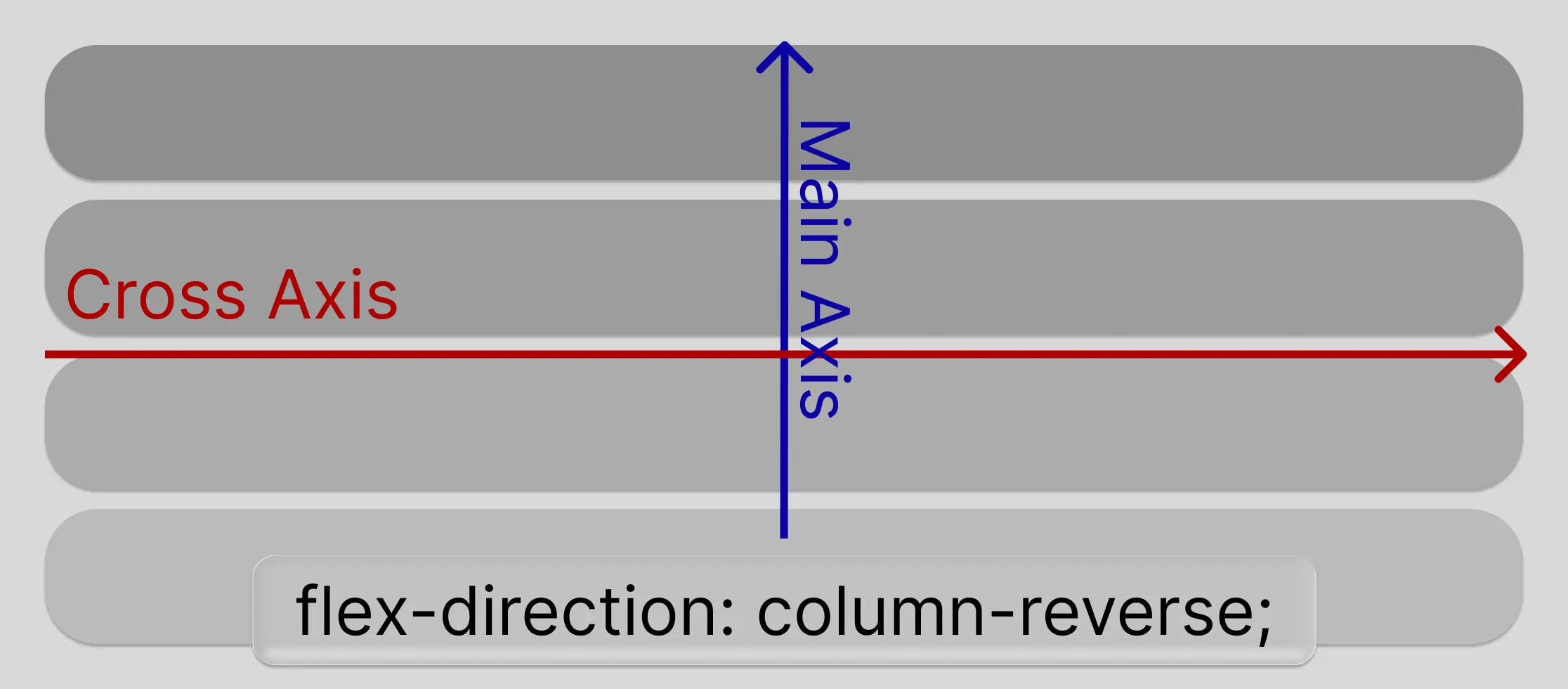
The flex direction has 2 more values: the same ones, but reversed: row-reverse and column-reverse. These values will render the items in the same direction, but in reverse order.
<div style="display: flex; flex-direction: row-reverse;">
  <div style="background-color: lightblue;">Column 1</div>
  <div style="background-color: lightgreen;">Column 2</div>
  <div style="background-color: lightcoral;">Column 3</div>
</div>

<div style="display: flex; flex-direction: column-reverse;">
  <div style="background-color: lightblue;">Column 1</div>
  <div style="background-color: lightgreen;">Column 2</div>
  <div style="background-color: lightcoral;">Column 3</div>
</div>The flex-direction specifies the MAIN axis of the flexbox container. Imagine it as an arrow going from the start of the container to the end of the container. The items will be ordered along that axis. This axis is very important for you to visualize the next properties, which are justify-content and align-items.
Before we continue with the content alignment, there is one other property for you to know: flex-wrap. This property defines whether the items should wrap to the next line or not. By default, flexbox does not wrap its items, but you can change that by setting the flex-wrap property to wrap. You know how words wrap to the next line when they reach the end of the line? Well, flexbox can do that too. Let’s see an example:
<div style="display: flex; flex-wrap: wrap;">
  <div>Lorem</div>
  <div>ipsum</div>
  <div>dolor</div>
  <!-- ... many more elements -->
</div>// TODO Graphic of the flex-wrap property
Justify content
Remember the main axis? Well, the justify-content property defines how the items are aligned along that axis. It has 5 values:
flex-start(default): aligns the items to the start of the main axisflex-end: aligns the items to the end of the main axiscenter: aligns the items to the center of the main axisspace-between: distributes the items evenly along the main axis, with the first item at the start and the last item at the endspace-around: distributes the items evenly along the main axis, with equal space around each item
justify-content: start
justify-content: end
justify-content: center
justify-content: space-between
justify-content: space-around
Now let’s swtich the container to a column layout and see how the justify-content property works in that case:
justify-content: start
justify-content: end
justify-content: center
justify-content: space-between
justify-content: space-around
Align items
The align-items property defines how the items are aligned along the cross axis of the flexbox container. The cross axis is perpendicular to the main axis, so if the main axis is a row, the cross axis is a column and vice versa. It might sound confusing at first, but it is really not.
The align-items property also has 5 values:
flex-start: aligns the items to the start of the cross axisflex-end: aligns the items to the end of the cross axiscenter: aligns the items to the center of the cross axisbaseline: aligns the items to the baseline of the cross axisstretch(default): stretches the items to fill the cross axis
align-items: start. Sticks them to the start of the cross axis.
align-items: end. Sticks them tho the end of the cross axis.
align-items: center. Sticks the center of the divs to the center of the cross axis.
align-items: stretch. Stretches all the divs to stick to the start and end of the cross axis.
align-items: baseline
Column 1
Column 2
Column 3
The baseline value might have inconsistencies across all browsers, so
it is not recommended to use it. It is supposed to align the boxes in such a way that the text in them appears to be on the same line. It is better to use flex-start, flex-end,
center or stretch.
Let’s see how the align-items property works in a column layout:
align-items: start. Sticks them to the start of the cross axis.
align-items: end. Sticks them to the end of the cross axis.
align-items: center. Sticks the center of the divs to the center of the cross axis.
align-items: stretch. Stretches all the divs to stick to the start and end of the cross axis.
align-items: baseline
Column 1
Column 2
Column 3
As you might imagine, the baseline is doing shananigans again.
Self alignment
The align-self property allows you to override the align-items property for a single item. It has the same values as the align-items property, so you can use it to align a single item differently from the rest of the items in the container.
align-items: start with one item that is end.
There is also justify-self property, but it is not supported in flexbox. It is only used in CSS Grid, which we will cover next.
Growing and shrinking
The flex-grow and flex-shrink properties allow you to control how much a flex item should grow or shrink relative to the rest of the flex items in the container. It accepts unitless numbers, where 1 means that the item will grow or shrink equally with the rest of the items in the container. If you set it to 0, the item will not grow or shrink at all.
If you set it to 4 for example, the item will grow or shrink 4 times more than the rest of the items in the container. The flex-basis property defines the initial size of a flex item before it is stretched or shrunk. It can be set to a specific value, like 100px, or to a percentage of the container size, like 50%. The flex property is a shorthand for flex-grow, flex-shrink, and flex-basis.
Example of flex-grow and flex-shrink:
<div style="display: flex;">
  <div style="flex-grow: 1; background-color: lightblue;">Column 1</div>
  <div style="flex-grow: 2; background-color: lightgreen;">Column 2</div>
  <div style="flex-grow: 1; background-color: lightcoral;">Column 3</div>
</div><div style="display: flex;">
<div style="flex-grow: 1; background-color: lightblue;">Column 1</div>
</div>If a single item has flex-grow: 1, it will take all the available space in the container, while the other items will not grow at all. If you set flex-grow: 0 for an item, it will not grow at all, even if there is available space in the container.
Example of basis:
<div style="display: flex;">
  <div style="flex-basis: 20%; background-color: lightblue;">Column 1</div>
  <div style="flex-basis: 50%; background-color: lightgreen;">Column 2</div>
  <div style="flex-basis: 30%; background-color: lightcoral;">Column 3</div>
</div>If the basis is set to a percentage, it will be calculated based on the container size. If it is set to a specific value, like 100px, it will be that size regardless of the container size. If it is set to auto, it will be the size of the content inside the item. If it is set to 0, the item will not take any space in the container, but it will still be displayed.
There is also a shorthand property called flex, which combines flex-grow, flex-shrink, and flex-basis into one property. It is a very convenient way to define the flex properties of an item in one line.
<div style="display: flex;">
  <div style="flex: 1 1 20%; background-color: lightblue;">Column 1</div>
  <div style="flex: 2 1 50%; background-color: lightgreen;">Column 2</div>
  <div style="flex: 1 1 30%; background-color: lightcoral;">Column 3</div>
</div>Ordering
The order property allows you to change the order in which the flex items are displayed in the container. By default, all items have an order of 0, but you can change that by setting a different value for the order property. The lower the value, the earlier the item will be displayed in the container.
<div style="display: flex;">
  <div style="order: 2; background-color: lightblue;">Column 1</div>
  <div style="order: 1; background-color: lightgreen;">Column 2</div>
  <div style="order: 3; background-color: lightcoral;">Column 3</div>
</div>Align content in multiline flexbox
If you have a flexbox with it’s wrap property set to wrap, you can use the align-content property to control how the lines are aligned in the container. It has the same values as the justify-content property, but it applies to the cross axis of the flexbox container.
// TODO Graphic of the align-content property
Recap of flexbox
Flexbox is a powerful layout tool that allows you to create flexible and responsive layouts with ease. It is great for building layouts that require alignment and distribution of space among items in a container. The main properties you need to know are:
display: flex: defines a flexbox containerflex-direction: defines the main axis of the flexbox containerflex-wrap: defines whether the items should wrap to the next line or notjustify-content: defines how the items are aligned along the main axisalign-items: defines how the items are aligned along the cross axisalign-self: defines how a single item is aligned along the cross axis, overriding thealign-itemsproperty for that itemflex-grow: defines how much a flex item should grow relative to the rest of the flex items in the containerflex-shrink: defines how much a flex item should shrink relative to the rest of the flex items in the containerflex-basis: defines the initial size of a flex item before it is stretched or shrunkflex: a shorthand property that combinesflex-grow,flex-shrink, andflex-basisinto one propertyorder: defines the order in which the flex items are displayed in the container
We will dive deeper into flexbox in the CSS course where every portion of it will be explained in detail with examples and exercises.
CSS Grid
CSS Grid is a powerful layout tool that allows you to create complex layouts with ease. It is great for building layouts that require rows and columns, like a table or a grid. The main difference between Flexbox and Grid is that Flexbox is one-dimensional, meaning it can only handle either rows or columns at a time, while Grid is two-dimensional, meaning it can handle both rows and columns at the same time.
Grid is a layout system that allows you to create a grid of items, where each item can span multiple rows and columns. It is great for building layouts that require precise control over the placement of items in a grid.
Grid Item 1
Grid Item 2
Grid Item 3
Grid Item 4
Grid Item 5
Grid Item 6
Grid Item 7
To create a grid, you need to define a container with the display: grid property. Then, you can define the number of rows and columns in the grid using the grid-template-rows and grid-template-columns properties.
<div
  style="display: grid; grid-template-columns: 1fr 1fr 1fr; grid-template-rows: 1fr 1fr;"
>
  <div style="background-color: lightblue;">Column 1</div>
  <div style="background-color: lightgreen;">Column 2</div>
  <div style="background-color: lightcoral;">Column 3</div>
  <div style="background-color: lightyellow;">Column 4</div>
  <div style="background-color: lightpink;">Column 5</div>
  <div style="background-color: lightgray;">Column 6</div>
</div>In most cases you do not need to define rows. The grid will automatically create rows based on the number of items you have in the container. You can also use the grid-auto-rows property to define the height of the rows if you want to.
Grid uses a special unit called fr, which stands for “fraction”. It allows you to define the size of the rows and columns in a way that is relative to the size of the container. For example, if you set grid-template-columns: 1fr 2fr, the first column will take 1/3 of the available space and the second column will take 2/3 of the available space.
You can also use other units like px, %, em, rem, etc. to define the size of the rows and columns, as well as the auto value, which will make the row or column take the size of its content.
<div style="display: grid; grid-template-columns: 100px 200px auto 1fr;">
  <div style="background-color: lightblue;">Column 1</div>
  <div style="background-color: lightgreen;">Column 2</div>
  <div style="background-color: lightcoral;">Column 3</div>
  <div style="background-color: lightyellow;">Column 4</div>
</div>Here the first column is 100px wide, the second column is 200px wide, the third column will take the size of its content, and the fourth column will take all the remaining space in the container.
If you want to create a grid with equal rows and columns, you can use the repeat function. It allows you to define a number of rows or columns with the same size.
<div
  style="display: grid; grid-template-columns: repeat(3, 1fr); grid-template-rows: repeat(2, 1fr);"
>
  <div style="background-color: lightblue;">Column 1</div>
  <div style="background-color: lightgreen;">Column 2</div>
  <div style="background-color: lightcoral;">Column 3</div>
  <div style="background-color: lightyellow;">Column 4</div>
  <div style="background-color: lightpink;">Column 5</div>
  <div style="background-color: lightgray;">Column 6</div>
</div>More on CSS functions like repeat in the CSS course.
Grid items
Once you have defined a grid container, you can place items in the grid using the grid-column and grid-row properties. These properties allow you to specify which columns and rows an item should occupy in the grid.
<div
  style="display: grid; grid-template-columns: 1fr 1fr 1fr; grid-template-rows: 1fr 1fr;"
>
  <div style="grid-column: 1; grid-row: 1; background-color: lightblue;">
    Column 1
  </div>
  <div style="grid-column: 2; grid-row: 1; background-color: lightgreen;">
    Column 2
  </div>
  <div style="grid-column: 3; grid-row: 1; background-color: lightcoral;">
    Column 3
  </div>
  <div style="grid-column: 1; grid-row: 2; background-color: lightyellow;">
    Column 4
  </div>
  <div style="grid-column: 2; grid-row: 2; background-color: lightpink;">
    Column 5
  </div>
  <div style="grid-column: 3; grid-row: 2; background-color: lightgray;">
    Column 6
  </div>
</div>Ordering also works in CSS Grid:
<div
  style="display: grid; grid-template-columns: 1fr 1fr 1fr; grid-template-rows: 1fr 1fr;"
>
  <div style="order: 2; background-color: lightblue;">Column 1</div>
  <div style="order: 1; background-color: lightgreen;">Column 2</div>
  <div style="order: 3; background-color: lightcoral;">Column 3</div>
  <div style="order: 4; background-color: lightyellow;">Column 4</div>
  <div style="order: 5; background-color: lightpink;">Column 5</div>
  <div style="order: 6; background-color: lightgray;">Column 6</div>
</div>You can also define how many columns and rows an item should span using the grid-column and grid-row properties with the span keyword.
<div
  style="display: grid; grid-template-columns: 1fr 1fr 1fr; grid-template-rows: 1fr 1fr;"
>
  <div style="grid-column: span 2; background-color: lightblue;">Column 1</div>
  <div style="grid-column: span 1; background-color: lightgreen;">Column 2</div>
  <div style="grid-column: span 1; background-color: lightcoral;">Column 3</div>
  <div style="grid-column: span 3; background-color: lightyellow;">
    Column 4
  </div>
  <div style="grid-column: span 1; background-color: lightpink;">Column 5</div>
  <div style="grid-column: span 2; background-color: lightgray;">Column 6</div>
</div>Notice how we’ve defined rows for the grid, but it still has more rows to fit its content.
Alignment in CSS Grid
CSS Grid also has alignment properties similar to Flexbox. The justify-items and align-items properties allow you to align items within the grid cells. The justify-content and align-content properties allow you to align the entire grid within the container.
Think of every cell as a flexbox container, so you can use the same properties to align items within the cells. The justify-items and align-items properties work similarly to justify-content and align-items in Flexbox, but they apply to the items within the grid cells.
align-content: flex-start;
align-content: center;
align-content: flex-end;
align-content: space-between;
align-content: space-around;
align-content: space-evenly;
align-content: stretch;
You can experiment with these prioperties to create a dynamic aligned grid layout. The content- properties are similar to the justify-content and align-content properties in Flexbox, but they apply to the entire grid container.
Gap
The gap property allows you to define the space between the rows and columns in the grid. It is a shorthand for grid-row-gap and grid-column-gap, which allow you to define the space between the rows and columns separately.
<div
  style="display: grid; grid-template-columns: 1fr 1fr; grid-template-rows: 1fr 1fr; gap: 10px;"
>
  <div style="background-color: lightblue;">Column 1</div>
  <div style="background-color: lightgreen;">Column 2</div>
  <div style="background-color: lightcoral;">Column 3</div>
  <div style="background-color: lightyellow;">Column 4</div>
</div>Bonus: Grid areas
You can also define grid areas using the grid-template-areas property. This allows you to create a named grid layout, where you can assign names to the grid areas and then place items in those areas.
<div
  style="display: grid; grid-template-areas: 'header header header' 'sidebar content content' 'footer footer footer'; grid-template-columns: 1fr 2fr 1fr; grid-template-rows: auto 1fr auto;"
>
  <div style="grid-area: header; background-color: lightblue;">Header</div>
  <div style="grid-area: sidebar; background-color: lightgreen;">Sidebar</div>
  <div style="grid-area: content; background-color: lightcoral;">Content</div>
  <div style="grid-area: footer; background-color: lightyellow;">Footer</div>
</div>Recap of CSS Grid
CSS Grid is a powerful layout tool that allows you to create complex layouts with ease. It is great for building layouts that require rows and columns, like a table or a grid. The main properties you need to know are:
display: grid: defines a grid containergrid-template-columns: defines the number of columns in the gridgrid-template-rows: defines the number of rows in the gridgrid-column: defines which columns an item should occupy in the gridgrid-row: defines which rows an item should occupy in the gridgrid-column-start: defines the starting column of an item in the gridgrid-column-end: defines the ending column of an item in the gridgrid-row-start: defines the starting row of an item in the gridgrid-row-end: defines the ending row of an item in the gridgrid-area: defines the area of the grid that an item should occupygrid-auto-rows: defines the height of the rows in the gridgrid-auto-columns: defines the width of the columns in the gridgrid-gap: defines the gap between the rows and columns in the gridjustify-items: defines how items are aligned within the grid cellsalign-items: defines how items are aligned within the grid cellsjustify-content: defines how the entire grid is aligned within the containeralign-content: defines how the entire grid is aligned within the container
Summary
In this lesson, we covered the basics of Flexbox and CSS Grid, two powerful layout tools in CSS. We learned how to create flexible and responsive layouts using Flexbox, and how to create complex grid layouts using CSS Grid. We also learned about the main properties of both layout systems and how to use them to align and distribute space among items in a container.
More advanced topics like nested flexbox and grid layouts, as well as responsive design techniques, will be covered in the CSS course. For now, you should have a good understanding of how to use Flexbox and CSS Grid to create layouts in your web projects.

About the author
Vasil Kostadinov


Software developer, specializing in React, Next.js and Astro for the frontend, as well as in Supabase and Strapi for the backend. Creates content in all shapes & sizes in his free time.